ProductsFinancial IntelligenceInvestment Trends
Last quarter’s split and this one’s were counted differently.
Read engineering investment across periods at whatever scope you pick — the org, a group, or one team — with the same five categories and the same derivation underneath every view. Weekly or monthly, in cost or in share, so a comparison between two periods actually means something.
The same day, run twice.
Here is the Tuesday budget season opens — once as it goes today, once with every period already counted the same way.
Budget season opens. Every team assembled its “numbers” differently, so the planning meeting is really a negotiation between spreadsheets.
COSTS · negotiation theaterEvery team’s numbers came out of one derivation, so there is nothing to reconcile before the conversation starts.
INSTEAD · one derivation, nothing to reconcileSomeone asks how much has gone to keeping the lights on since last year. Nobody can answer without a week of spreadsheet archaeology.
COSTS · a week of archaeologyYou open the trend: every period by category, in cost or in share — comparable because the derivation never changed underneath.
INSTEAD · the trend, already drawnThe forecast ships anyway — built on vibes, defended by whoever argues best.
COSTS · a forecast built on vibesThe forecast starts from numbers finance and engineering both trust; the argument is about the future, not the data.
INSTEAD · argue the future, not the dataThe budget meeting didn’t change — the numbers underneath it did.
One derivation, every scope, every period.
- The trigger — it starts from the same classified activity.One classification engine feeds every view — the same derived allocation that powers Investment Allocation, so team, group, and org are never three different spreadsheets.
- The work — it counts every period the same way.The same five categories and the same derivation apply at whatever scope you select — the org, a group, or one team — and to every period on the chart. That is what makes two periods, or two teams, comparable at all: nothing about the counting changed between them.
- The artifact — a trend both sides trust.Investment by category and team across periods — the starting point for budgeting and forecasting on real numbers instead of reconstructed ones.
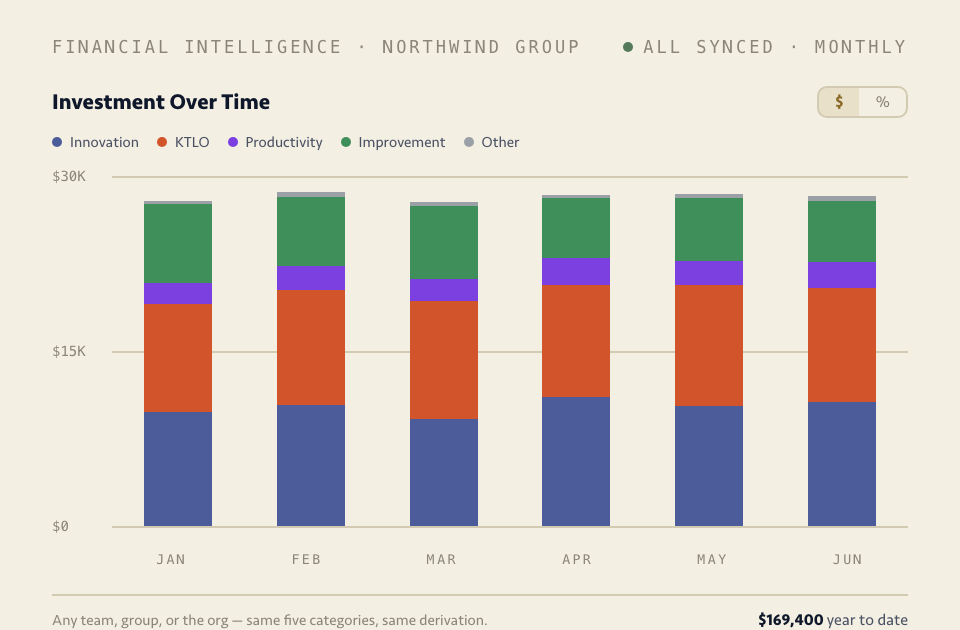
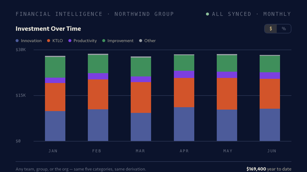
The comparison, already drawn.
Every period side by side, category by category — comparable because every one of them came out of the same derivation.
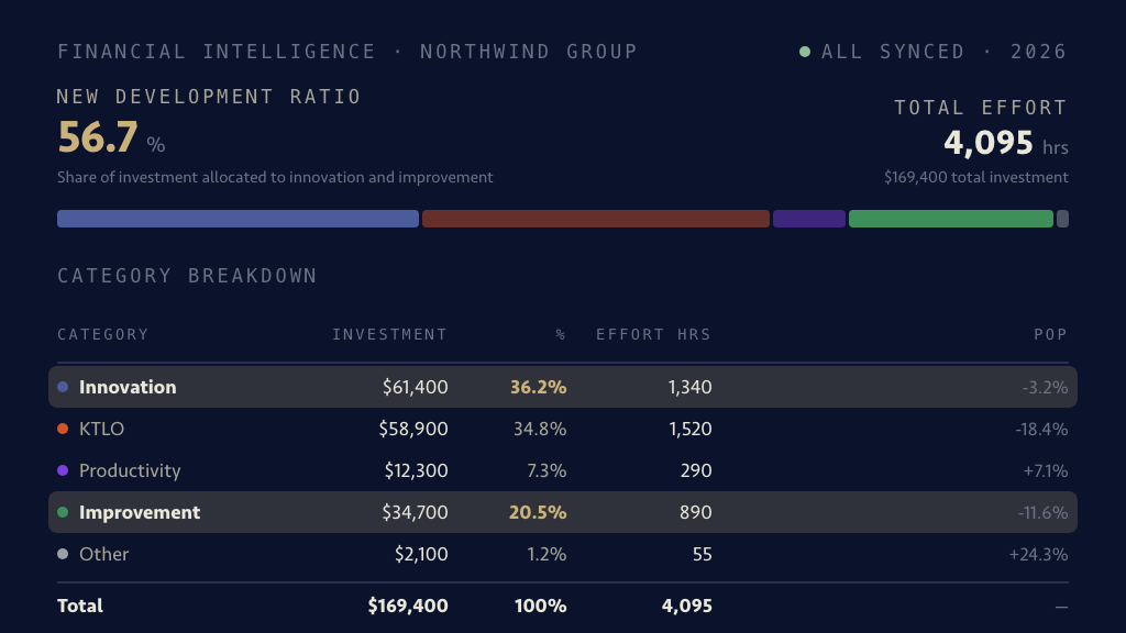
Any bar on that chart opens as this: the five categories with their cost, share, and effort hours — the same derivation, one altitude down.
Fair questions, answered plainly.
Our teams work completely differently — is comparing them even fair? +
Comparing team performance across different kinds of work isn’t fair, and this doesn’t do it. Each team is read on its own, at its own scope, and what you can compare is allocation mix — where its capacity went, category by category — on one consistent derivation. A platform team running heavy on KTLO isn’t “worse” than a product team running heavy on Innovation; seeing the difference is what lets the org decide whether it’s the difference it wants.
How far back do the trends go? +
Trends deepen from the point your stack is connected, within your workspace’s data-history limits — a year of comparison needs a year behind it. The practical answer: connect early, because every period after connection is a period the archaeology never has to be done for.
Will this turn into a leaderboard? +
No — by policy, not by configuration. Regentis scores no individuals anywhere in the platform, and this reports category mix, not productivity ranking. What gets compared is allocation, so the conversation is about investment strategy rather than about who “won” the quarter.
Can we forecast directly from this? +
It’s the input, not the forecast. What it gives your planning process is a trustworthy starting point — real allocation trends by category, team, and period that finance and engineering read the same way. The decisions stay yours; what disappears is the week spent arguing about whose spreadsheet is right.
Walk into budget season with the numbers drawn.
Connect the stack and the first period is counted immediately — and every period after that deepens the comparison.